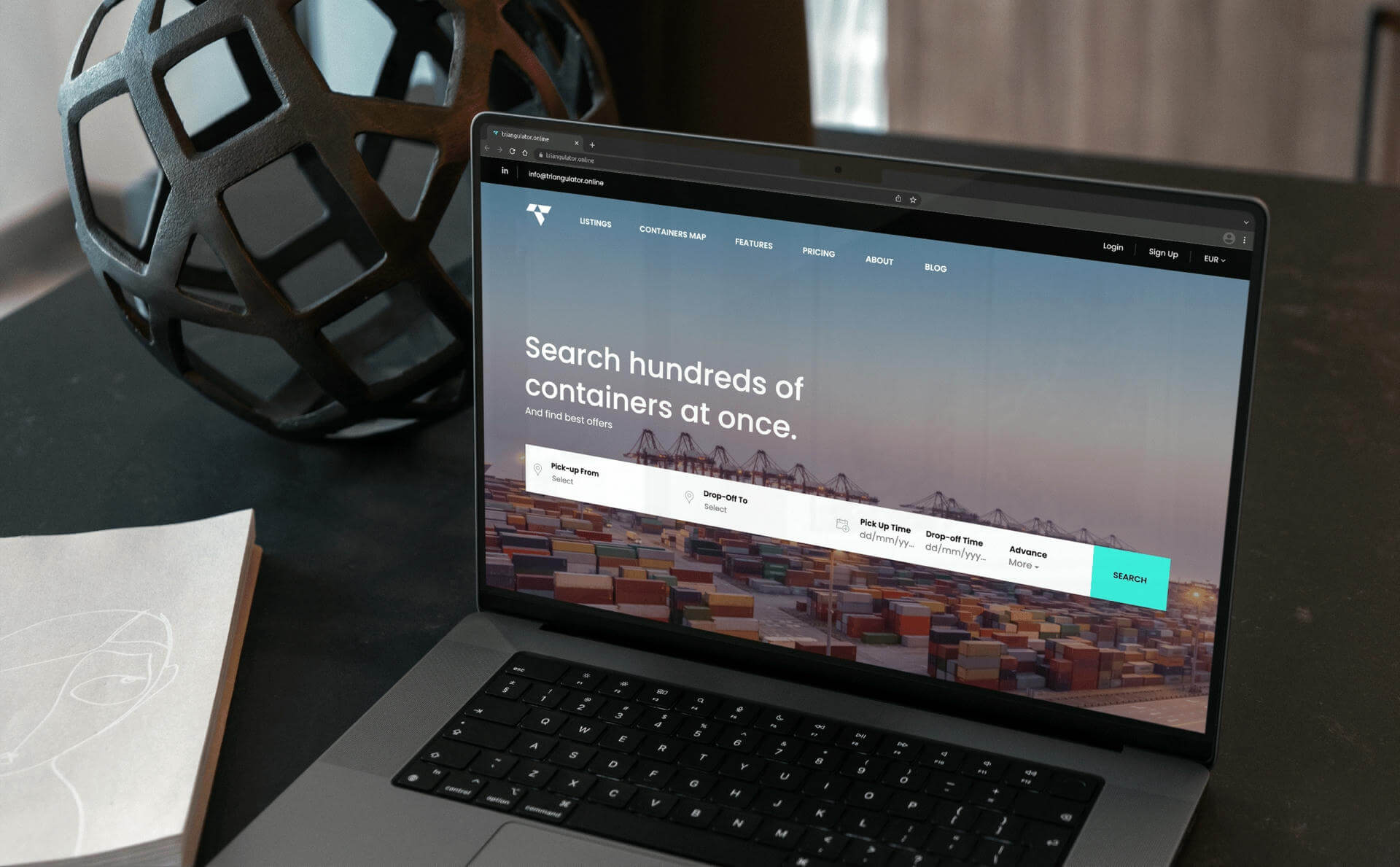
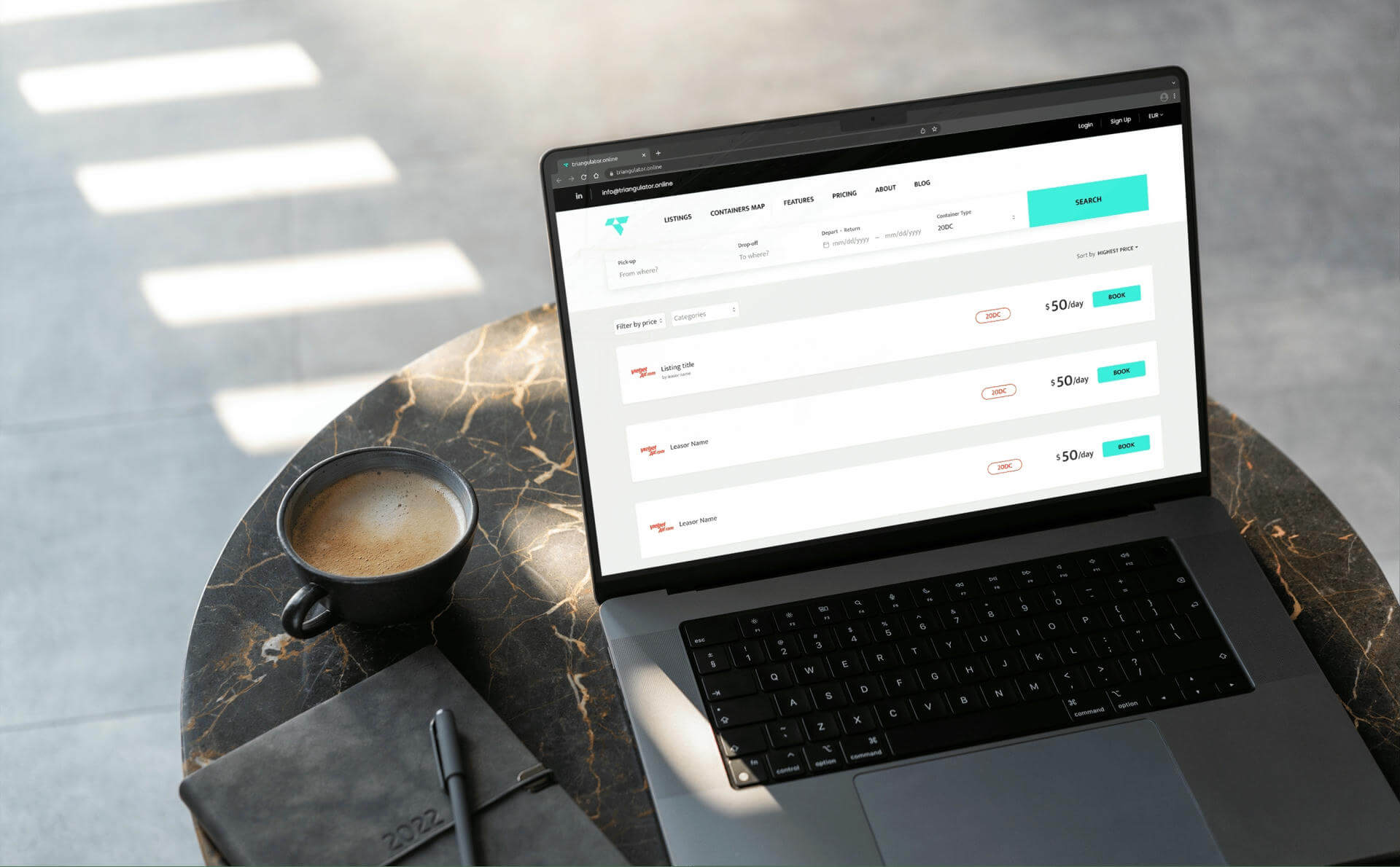
Triangulator is the new way to book and rent shipping containers via web app to maximize profits and minimize the hustle